Wednesday, 24 March 2010

Evaluation Question 4

4. How did you use media technologies in the construction and research, planning and evaluation stages?


This Adobe software was the absolute foundation to our product, its incredible and incomprehensible capabilities never cease to impress and astonish me and without these our media products wouldn't of existed, and without the opportunity to explore this software our enriching knowledge and awareness of the realms of both media print and video production wouldn't have existed. In specific case to the three tasks, without the software we would not have been able to create professional appearing media products.

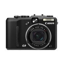
Afterr overcoming technical difficulties with the video camera whist out shooting on our first day, we used our iniciative and decided to film our footage on my camera a Cannon Powershot g9. 12.1 megapixels. The camera was sold to me with the knowledge that its quality in image is equal to its quality in video, this I remembered when suggesting we use the camera. This was actually a blessing in disguise as the positive factors of shooting footage onto a memory card is vast, although it does have a negative as you need many memory cards as appose to one a couple of tapes, but the security and instant behavior of a memory card proved to be useful, we could also re-watch the footage on the large play back screen instantly without worrying about winding the tape wrongly. To upload our footage to the computer we therefore used a memory card reader, this was quick and efficient compared to using the video camera capture tool for our practice video, this saved time and stress which we found extremely useful.

The other camera we used for our digipak photography was Hannah's Cannon SLR, the amazing fish eye lens manipulated our photos and was what set them apart. Using such a high class camera instantly gave our photography a professional finish.

When editing it was important to use the zoom tool, especially when working during the fast pace of the editing, working far out in unpredictable but again Final cuts ability to zoom far into the time line is genius. Another key fact was locking particular levels of the time line to prevent cuts that had been editing to move away from the music placing. The music track was lock permanently however when dragging clips from the library of clips the audio was atomically attached, thus you had to lock the levels of footage to delete the audio, if the levels were not locked it would delete the footage as well as the audio! If for instance one clips that had to be taken from a section of editing you would need to drag it directly to the level above, lock the lower layer, edit the clip you removed, unlock the lower layer and replace the clip all the prevent the time line automatically being shifted and eradicating minutes of precise editing. I know right..

The fine details of production

Post production effects:
Transitions - Cross dissolves - Fade in fade out dissolve
We used dissolves mainly during the slower parts of the track as it reflected the pace. but also to establish fading in and out of flash backs to enhance narrative.
Colour correction: was an important factor to our video to create a professional finish, a RGB balance Brightness/contrast bringing alive the already vivid colourings of mise en scene De-saturation also used to establish flask backs Overlays Soft edges - Vignette
Wide screen - this was a convention established, that all music videos are shot on a wide screen camera, however as we do not have the equipment to so we used the effect on final cut, this make the video appear professional.
When it comes to applying any of these effects onto footage there is one key factor...
Remember to Render.

All effects and transitions on Final Cut can be altered to your personal liking, once the have been changed they can then be dragged over the shot on the time line, each shot has to be rendered for the effect to be added, however if you hold the time line arrow over the shot whilst you drag the effect over you get a preview of what the effect looks like, which saves time.
Colour correction: RGB balance - This effect allows you to specifically change the tonal qualities of an image. By increasing the number of each you are highlighting that particular tone in the image. We increased the Red balance during the bedroom scene for example. The screen shot below shows where you can change the balance by moving the toggle or for precarious change clicking on the small arrow either side of the spectrum time line.
Cross dissolves and Fade in Fade out transitions
God almighty what important features to producing a video. These effects are changeable but only in length, to change the length of a dissolve you drag the effect between the two desired shots, the dissolve drops its self over half of each cut aside it, then clicking and holding down on one side of the dissolve you can drag the dissolve to the acquired length, using the zoom tool for precision. Being able to change the lengths of the transitions as it is extreamly important, a longer dissolve will slow down the pace of the music, if the dissolve is too slow however it can off set the editing.
Brightness and contrast how we love you
To dramatise and bring alive the lighting / colourful mise en scene, we changed the contarst of almos
t every shot, changable to each of its particular level of lighting. This again was a case of trial and error, changing the levels using the mouse or arrow keys before dragging it down over the clip and seeing its result.
Overlay that up!
To the left is a screen shot of how an overlay is created. One layer of film is put onto a higher level in the time line above the other. In the bottom far left hand corner is a button with what appears to be a mountain shape. You have to click this so that the black lines which run through each shot shown above is visible.
These lines are dragged up and down, the further down the less opaque that image, more transparent so the other image appears through. Again trial and error is used when moving the lines, with the time line arrow kept over the two shots so that the preview box shows what the effect will appear like. This image also illustrates the change in lengths of cross dissolves and fades, the top overlays needs to be faded in an out so that it was seamless.image of the toggle button in the bottom left hand corner which allows you to create overlays

Screen grabs from final cut, using the media
Here the screen shot captures the moment of a desaturated flashback, we needed to do this for differentiation so the footage was destaurated to a high level. Also an effect called soft edge was used, you could change the level of soft blackness for each side.

The cross dissolve before our protagonist begins to lip sync. The cross dissolve as you can see is relatively long to fit to the pace of the music.
If you look closely at the time line you can see the repetitive nature to our introduction. Using fade in fade out dissolves between each flashback, the lengths of these were precisely the same so that the editing was sharp.


One of our favorite overlays produced, the brightness and contrast changed so that the two images blended correctly. Below is a screen grab of the gate shot which was tedious, and a mash up of overlays, cross dissolves and fade to blacks, zoomed fully in we worked closely with the razor tool, cutting up a very long section of film to find the action we wanted, then laying them aside each over on the time line overlaid the images which would look best together, his positioning had to be exact for the effect to work.

Beginning to use the Final cut software and gaining knowledge of it relies greatly on trial and error which is really what determined our time management when editing the video; along with our personal weakness of being too precise and our attention to detail with everything which resulted in us almost unable to produce a rough cut as we personally wanted to go over each section with a fine tooth comb.
Although we were limited by our own knowledge of the Final cut software it was the amazing ability of the programme that enabled us to extend the creative control we had over our ideas/original footage and actually produce the, what we thought would be, almost impossible ideas in our imaginations.
The complimentary software Adobe Indesign and Photoshop we were already at home with because of our AS coursework, thus this is why the digipak and magazine advert tasks took far less time.

Using the magic lasso tool and changing opacity of layers to create this is photoshop

Using photoshop elements - My home programme.
Indesign's automatic alignment programming was again extremely useful to create our simplistic yet stylish design. Font changing size was made easier by holding down command and dragging the text box, as this changes the width and height of the text to fit.

Evaluation Question 3


3. What have you learned from your audience feedback?
Our process of gathering feedback began from the first rough cut,
on my blog post here you can see the feedback we gained from our teacher and what steps we took to begin to correct these problems we encountered.


We needed to interview people who roughly fell into our target audience, we asked people wo were are all aged between 18 and 27 but were mixed gender, they were all media and music fans so have a understanding for music and music videos.


To find out whether our target audience found the final products appealing after the construction was finished, I devised a questionnaire to see how marketable the product would be in the media world, will this be a credible video?


Quotes from responses -
Question 1 & 2 : 'I was hit by the vibrant use of colour and the drastic change of editing to the song, very dramatic' - Nathan Manning age 22

'Initially i enjoyed the narrative to the story and the emotion portrayed by the actor' - Media Student

The choice of Mise en scene throughout was dramatic - Media Student
'The lighting was clever' - Media Student

The change of camera angles throughout the video was striking, and the use of colour was very good - Media Student

Initially the pace of the editing stands out most, however the use of overlays was a unique aspect so stood out- Alice Bennett

My favorite shot was about half way through, the pace of the music slowed, an overlay was used on top of a close up - Media Student

All the overlays i thought were great - Martin Manning

The digipak stands out due to the vibrant colours, along with the magazine article which looks very professional - Media Student

Question 3: Definitely looks like the ones i watch on MTV - Nathan Manning age 22

The video reminds me of established videos i have seen before - Media Student

Question 4: I noticed a lot of graffiti, in the tunnel the video came across as very urban. And he was wearing a hoody which helped - Nathan Manning age 22

The use of graffiti and mise en scene made it very urban and gritty - Media Student
I think it does as you have picked appropriate locations and the actor conveys a urban attitude and behaviour- Media student

Question 5: The use of lighting and colour is constant over all three tasks - well done - Nathan Manning age 22

Both the video, magazine and Digipak have dark back grounds with a good use of colour, they look similar

The emotion captured is consistent in the photography and video. - Media Student

The three products look very similar on first glance due to the use of photography and font Media Student

Question 6 - The digipak and Magazine advert both stand out due to their striking use of photography and the high quality of the images - Nathan Manning age 22

The photographs are dramatic and eye catching, the contrast used enhances this - Media Student

The mise en scene of the photographs and the simplicity of the design is what makes it looks professional - Media Student

Question 7 - Of course, it looks professional and intriguing, the choice of photographs establish the type of CD it will be also.

After viewing the video, listening to the track and seeing the magazine advert i would have a high standard for the rest of the album and would definitely buy it - Nathan Manning age 22.

Any other comments - Most were celebratory, Well done!

Using my brother as he is in the prime age of our target market, i told him to be honest and he was very positive about our products. The media students have an awareness of what we were trying to capture so positive responses from them mean we have achieved our goals.
Response from the Plan B fan base - Our true target market.

As well as people answering these questions on paper, we decided to video a few of the people answering the questionnaire and fellow media students to give us a technical view on the video.


'use of transitions' 'The lighting is vibrant..yet dark to reflect the mood of the character in your video' 'It looked professional' 'the way the tension was built up throughout the video' 'the editing worked well with the pace of the music' 'the use of overlays and how the lighting enhanced it'

To gain a repsonse from the
The second step to gaining feedback was to post the video on the social networking site facebook after uploading it to viemo. This provided us with instant positive feedback which we screen grabbed.

Colloquial but useful feedback is shown in the image above.
Overall the feedback was extremely positive which was pleasing due to the time ( blood sweat and tears ) put into the video. The audience did pick up on aspects that we hoped -
the main aspects of our feedback was the use of post production effects, lighting, fast editing and mise en scene. The use of lighting, camera angles and mise en scene was was said to be ‘creatively directed’. The house style of our brand was noticeable as feedback mentioned the use of fonts, colouring and lighting threaded between the three media platforms. Thus I can conclude that our media product would be credible in the media world.


Evaluation Question 2

How effective is the combination of your main product and ancillary texts?
Through my research i can conclude that conventions of a overall brand includes coherence over the differing media platforms, the magazine cover, digipak and video will use the same images, fonts and even mise en scene to make the brand easy to identify for the audience and promote the brand more efficiently; a convention established in retrospect after researching into both. Illustrated on my blog here.

Our target audience was concluded after research into the market of our artist and genre, on my blog post here i state that our target market is our aim was thus to create an urban brand product and successfully market to this to our audience by appealing to them in hope to encourage sales of our artist.

(P.s, after viewing our music video, many people have brought the track from itunes or downloaded it, it has also encouraged people to by the dvd of the film which recently was released!)

Connections between the tasks
Strong lighting contrasting to the dark setting is captured in all three tasks also and would be a memorable factor to our house style, lit by strong artificial outside lighting which enhances the vibrant red, greens, yellows and blue tones. These colours are illustrated vividly in the choice of colouring for our digipak.
Each panel of the digipak uses the tunnel photography which, like the video, establishes the urban setting perfectly. The lighting would appeal to our majority male target audience,primary colours have no particular gender connotations; our audience has a female minority which this lighting would also appeal to without males finding it unappealing; harsh and gritty rather than bright and pastel.
The font 'new garden' has been used for both the digipak and magazine article to again maintain a cogent brand style, as many bands continuous use the same font. Again this font is not gender specific, it is bold and clean without being too harsh and male orientated. such as the font shown below.


The main promotion image
The photograph we used to promote brand identification was the dramatic shot of our protagonist underneath a street lamp, his clothing, the lighting, his facial emotion and stance all embody the urban brand entirely; the colouring in the image reflects our house style also.

Screen shot of the image from our video, the hook to our other tasks: Overlay with a fish eye lens shot of blurred lights which mirrors the album cover which is overlayed with a fish eye lens shot of stark tunnel lighting at Leake st. The composition of the shot is visually inviting and captivating for the audience, his head and shoulders a triangle framed by a circular fish eye, lights run horizontal across the image in both cases drawing the eye to the centre of the image and thus the intense emotion captured in his face; which i suggest embodies but contemplation and regret.


The photoshop image has three overlays which compliments the use of overlay throughout the video and each photograph maintains a consistent emotion. By using screen shots from the video to overlay the main photograph ties the visuals together and the audience will be able to remember the images from the video and identify them with the advert and digipak. Tunnel imagery is also subtly used on the magazine article photograph to tie the three tasks together, as well as an image of smoking.

Smoking is laced through the video which compliments the urban image of our protagonist yet also suggests anxiety, this is reflected in the magazine article to promote this urban image and again tie together the two platforms. Stereotypically our majority male urban target audience would relate to his anxious smoking, also smoking is an iconic urban image, his costume again reiterating the image of our target audience.

Photobucket


Narrative
Another established convention of relation to target audience is that they could generally relate to the narrative behind the video, thus the visuals included, an example of this was (link to blog)
The opening image of a bleeding nose, the cause of which is left as a mystery, has stereotypical male connotations, weather a result of a fight or purely a fall an urban male audience between 18 - 28 would be able to relate to this prospect.

this is similar to the confrontation during the middle of the narrative. Anger, confrontation and defensiveness is a stereotype which surrounds our target audience and these traits surface quickly in our male protagonist once provoked, again leashing his anger on the other male actor a common scene in love triangles and society. Again this timeless theme of relationships heartache and love triangles is easy to empathise with; our minority audience of females thus too will be able to relate to the narrative of being 'stuck in the middle' of the situation.

A kebab shop has obvious male connotations to link to our audience, stereotypically concerned with post drunk male hunger which hosts drunken confrontation. Ironically for our protagonist it is a place which ignites memories of a once happy relationship.
This is another facet which will relate to our target market, even thought possessing a hard male exterior the memories of his love is vividly intimate, lips hands and affection is obviously important and is what predominates his mind; the vice to his anger. I think our narrative both a male and female audience can relate to yet a man will be able to empathise with our male protagonists actions and emotions successfully.

Evaluation Question 1

1. In what ways does your media product use, develop or challenge forms and conventions of real media products?

For my evaluation against conventions i've decided to use the statements made by Craig Davis' in his article 'Approach to analysing Music Videos' which i posted on my blog here, his points enforced the conventions I gathered after looking at existing videos. Ive picked out the parts of the article which are appropriate to our video and highlighted the points i think we have established.
Conventions Include:
Illustrating the lyrics and sound with creative interpretations
Expressive Lighting
Lip synching
Jumps between a wide range of shots but primarily close ups
The pace of editing matching the pace of the music
Innovative effects
Mise en scene which mirrors the tracks genre/tone


Lip syncing

To apply to the established convention of lip syncing our male protagonist mouthed the lyrics we thought most poignant. Artists within our genre tend to only mouth parts of the song, as the video replies a lot on narrative which contrasts to the almost continuous lip syncing performed by many pop artists. To instantly catch and maintain the audiences attention the opening dramatic lyrics were mouthed framed in a close up; 'When the blood dries in my veins....I know I'll be on my way to heavens door', a static camera mirrors his static positioning and the slow pace of the song which changes immediately after. The second screen grab depicts the other main section of lip syncing to the emotional lyrics 'I can feel something happen that I've never felt before',
this image depicts the second main section our protagonist lip syncs, shot with a fish eye lens again the camera is static to capture and enhance the emotion. Our use of fish eye is used to appeal to our target audience as it creates a unique, creative appearance to the video and contrasts to the rest of the video, adding diversity and maintains the eyes interest. The lyrics mouthed here state 'I can feel, something happen that I've never felt before', as he moves toward the camera the fish eye also enhances the intimacy with the audience, as his body and eye focuses directly on the camera his emotion is transferred to the audience.

The use of blurred close ups during the protagonists intimate flashbacks suggests that his memory is becoming distant and lost, hand held camera movement around the couple emphasises the facet that is it a memory and intimate body parts such as hands and lips are framed in extra close ups to state their importance in his mind.

Our inspiration - Glass Jaw, Ape dos Mil

Editing


"Instead it is often the beat or rhythm of the track which provides the organising principle for editing movement" Craig Davis
'End credits' is a dynamic track, with sections that contrast starkly in pace, it commences with a slow acoustic pace as ends the same with slow moments laced through, creating a natural cycle in the video which explains why we repeat the beginning shot at the finish. Following the convention that editing will match the pace of the music, our editing therefore was a pace roller coaster throughout. Dissolve transitions such as cross and fade accompanied and emphasised the slow editing, yet these types of transitions had no place during the frantic editing as the drum and bass roots of the music surfaces. The top screen shot of our sequence illustrates the contrasting editing, the centre section a lapse in the quick pace followed by tight editing ,which is illustrated in the two screen shots below .


As the pace peaked, our narrative emotion peaked as the protagonist faces his disoriented anger which parallels the quick editing perfectly. The hand held point of view camera captures this confusion and delusion and invites the audience to also feel this emotion, cut fast between non point of view and fish eye lens shots creates a 'visually de-centered experience' and is visually exciting. The use of red tinted lighting mirrors his anger and isolation as his body is almost permanently in shadows, a metaphor for the inflicted regret.
A screen grab of the blurry fish eye lens shot, to enhance disorientation and diversity of shots.
Overlays accompanied by cross dissolves were used predominantly during flash backs of the couple together to enforce how his ex girlfriends has gone, and only remains now in his memories. The image shown above depicts this facet most, as the negative space in the long shot which shows him thinking against a lamp post is filled with a day dream overlay of the couple kissing above to portray his memory and emphasise his isolation. The dark sky in one shot complimented the dark background in the other so when overlayed both merged nicely.
Our inspiration : Director Anthony Mandler, Rihanna 'Russian Roulette' and 'Disturbia'

Used also for purely creative aestetic reason, we regularly used blurry traffic lights to overlay images, shot in darkness throughout the light overlays add vibrancy to an almost still shot.


Interpretation and illustration of lyrics


From the instant we heard the track and read the lyrics we stated words which we thought captured the essence of the emotion in the track stated on our moodboard. These words were: regret, anger, loneliness, lost, destruction, despair, distortion, contemplation, thus we endeavored to portray these emotions consistently throughout the video, different emotions surfacing at differing parts in the music's pace.

The shot below is repeated throughout the opening acoustic introduction and shows blood running from his nose, this is a an almost literal interpretation of the lyrics which states 'As the blood dries in my veins'; we reversed the dripping blood so that it too dried into his nose just before he sings. This is an example where we have creatively interpreted the lyrics.
During the conflict scene following the kebab shop, a hand held point of view from the second male is used to illustrate to the audience our protagonists violent, crazed yet fragile emotions, instant close up anger is thrown at the male accompanying his ex-girlfriend thus us, as he invades the camera he invades us and it is almost uncomfortable.
Point of view shots from our male protagonists are used when his disorientation and despair peaks, finding himself back in the room where they were once intimate, lost. Thus we have used point of view shots to convey the protagonists two different powerful emotions, lost and angry.
The use of shadows in the garage scene portrays and emphasises his isolation, as his only company is the sinister shadow thrown onto the brick wall. His shadow appears superior as he is framed in the bottom left hand corner, his body language suggesting closure and the high angled camera emphasising this further.


Lighting: By employing headlights as lighting which flooded into the garage, the shadows were more prominent, this lighting overall was effective, it added vibrancy and richness to our shots. The yellowish light created by the headlights used in the garage scenes contrasts starkly to the red musty lighting used in the bedroom which differentiates the two rooms as well as the two moods felt in either room, the garage hosting his despair and the bedroom his intimacy.
The video is predominately shot in darkness, thus artificial lighting such as streetlamps, tunnel lighting and traffic lights and utilised consistently throughout. The nighttime setting as well as these artifical lights identifies with the urban,gritty theme.


To emphasise this facet and encourage audience relation, a majority of our shooting was located in Leake St. a railway tunnel near Waterloo and an autherised graffiti area. Graffiti has typical connotations to the urban scene and would relate to many of our target audience, it also mirrors the track and compliments his costume and mood - aggressive and relentless.
His costume throughout is casual and reflects an urban image as a hooded jacket has obvious street connotations. Here framed in a medium close up the low angle camera conveys him in a superior light, however it is a reflection of his mood as he is attempting to rise above his emotions, this shot used at the beginning and end of the video again parallels the cycle of the music and would suggest that during the middle his volatile emotions are uncontrollable because of the events but either side he is attempting to feel superior.
Location shot - The garage's mise en scene is naturally gritty, exposed brick work and breeze block fit with the urban tone and the random props were kept in shot to illustrate where his situation has resorted him to, a desolate and grimy location.
Underneath Hackney Rd bridge. Green neon lights predominate underneath the bridge and highlight the tattered advertising posters curling from the brick, the shadows emphasise the sinister feel to the location and urban image of the brand we have created.

The established conventions of ancillary tasks can be found previously on my blog
here (magazine adverts) and here
(digipak)


Our magazine article employs simple font for ease of read, the white contrasting starkly to the black background which predominates the font. A release date and popular singles have been added to encourage sales along with positive critics from well known players in the music industry. A simple layout and design establishes the convention, record label and HMV logo increases the magazine authentication. The main centered image is the focus of the article and is eye catching due to its vibrant colouring.

Photobucket