

Our two ancillary tasks will have to promote our brand identification much like artists today. I decided to analyse also how the digipak and magazine articles link, and how a brand is established. After knowing this we will then be able to work towards successfully creating a coherent brand to fit to our urban genre artist, which will aim to appeal to our target audience.
These three magazine articles below I chose because of their similar clouring, black prodominates and yellows and whites are used for highlights such as font and in the photography. Each font seems to have a slight glow around the edge which makes it stand out and easy to read, also because of the scale of the font these magazines would be recognisable from a distance. The layout is simple using the photograph as the background with simple fonts at the bottom of the adverts.
 The magazine advert for Ellie Goulding mirrors the title of the album, 'Lights'. The image has been manipulated with gold streaks amongst her long feminine flowing hair; she too seems to glow much like the font. The image is flattering and her head positioning captures her in a elegant way, thus the advert immediately gives an impression of the artist. Reviews from the music industry have been used to promote the album, star ratings are a easy visual to read a rating. As she is a debut artist a close up image of her face has been used to promote artist recognition toward the artist, she has a intense gaze yet is not looking toward the audience to give the appearance of being captured in a non posed way.

After research into the digipaks of these artists you can see that the photography used in the magazine article is exactly the same in the digipaks. The font is the exactly the same also. This would mean that there is a coherence between the digipak and magazine article so that their target audience can identify the brand easily over many different media platforms.
Here these three images followed similar layout. The visuals are framed by a solid colour background which gives a very clean look. The font in all three images is placed in the centre of the advert, underneath the image or on top of the image. The viewers eye is therefore drawn to the focus image and secondly the large scale font underneath. The writing has been centre aligned in the case of Bloc Party and Eight Legs whereas the text in Laura Marling has been left justified; both work well. Simple font means the audience can read it easily, however the main focus is on the imagery.
In all three cases a date of release and the type of media has been described, eg. 'Avaliable 22nd March CD/Special edition CD&DVD/ Downloads' / 'New album 'The electric kool - aid cuckoo nest available 22nd February on CD Digital download' I prefer the more succinct way of conveying the information shown on Laura Marling's advert. As a sentence is not punchy enough for an advert, the important information needs to stand out to promote successfully.
Also information about the track included on the album is used, a popular track would be mentioned to again encourage sales.
 To continue with my research on brand identification i looked for the digipaks to these artists albums. Again the exact same font and image has been used as in the magazine advert. This reiterates the fact that digi pak and magazine adverts have to be cogent for brand and artist identification.
  These three advertisements vibrant use of colour attracted me to them. A prominent use of blues drew me toward the advert as i flicked the pages of the magazine; bright and striking. Two of the adverts use the artist to promote their identification for debut albums, whereas the Manic street preachers features a graphic image, as they are an established band this works.
 Photography is again extremely important, providing the focus of the layout to attract the attention of the audience. I like the bold large scale font used in Marina and the diamonds, i think it holds power and its wrapping around the artists face works well, the close up photograph of her face is again captured in an elegant feminine light, her chin raised and lips pouted, her glare is directed towards to the audience and her body language is very alluring; the audience would thus be drawn to this images intense glare. Her long dark shining hair is also an alluring aspect, it flows out of shot and has been used to layer white font over the top. The tapestry back ground fits with the indie /alternative genre of the music, similar in the way Florence and the machine has a strong floral theme - femininity is portrayed.
Legalistic information such as record companies, websites, logos, sponsors and places where they can be purchased are added to the bottom of all of these articles, thus is a convention of the adverts, this will encourage promotion.
Again the digipaks of these artists mirror every aspect of the magazine article. Font and imagery are key players in maintaining this coherence. The composition is also echoed in the digipak.


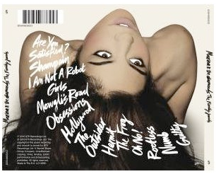
The Marina and the diamonds digipak conveys that similar photography posing would also be affective in continuing bran identification, taking the image from the same shoot would be useful in maintaining the similar image.
These three images were striking due to their beautiful photography. bright, clean and crisp these visuals sell the brand entirely. Centered font stands out to be in the case of yeah yeah yeahs and Noah and the whale below; the composition appears more balances and symmetrical than the advert in the middle.


No comments:
Post a Comment