

 Deftones - Saturday night wrist
The Overlay on this album cover is exactly the effect we were looking for, four images especially the close up of the eye adds depth and intensity to the cover, and image of the girl in the foreground has a beautiful emotion and illuminating, sensual lighting. Photography is the basic foundation to this cover, manipulated in clever ways and set alongside a sensible choice of font. In all images she is looking up which brings a consistency of emotion along with the powerful extra close up of an eye which is mirrored on the back for cogency. The small writing is simple yet effective, its positioning at the top allows the image to be the focus, as this will be the most memorable aspect of the front cover design. However on the back panel the title and name are prominent, larger font as the smaller logistic information is formatted below. White font contrasts to the black dark background so the title will stand out in both cases, same font again maintains coherence in design long with the consistent use of green back and red. The composition is very powerful, the eye is drawn to the diagonal line created by the three overlays of the women's face, yet the circle overlay brings the attention back toward the middle and the dramatic pose of the women, the images are not of the band or artist, yet correlate to the track. Unusually track listings haven't been added to the back, however this could ironically enhance sales as a sense of mystery and fan intimacy is created - by buying the album you privileged to the track names.
I picked out this over of Pink Floyd's 'Animal' cover as it focuses on location which is unusual. This image gives geographical notification of the artist for a global audience. It is iconic and is actually one of our chosen locations. The image covers both the back and the front, a simple way to maintain coherence. The power of the image and urban atmosphere conveys immense historical information and i think this proves that a timeless cover can be simple, and that location can be the basis of a digipak cover without having special effects or dramatic colouring - obviously due to the ear of the cover technical aspects such as colour manipulation would not have existed.
 An example of a modern cover which used location photography is bloc party's a weekend in the city. Again these both establish geographic location. A slow shutter speed captures passed car lights, yet as they have passed and only the light is left a sense of abandonment and stillness is captured and provokes a sense of thought. Vidid use of colouring is shown in both.

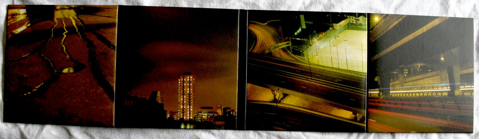 The location imagery transfers across all panels and all capture a vivid staleness of London. The urban tone is obvious, the red green and black tones are coherent throughout. Shadows and meager lighting is key to the digipak which creates a sinister ambiance. I took photographs of outside of the 6 paneled folding digipak. Against the scorching red sky the simple white font reads the title tracks that are aligned against the same line of the block of flats in the image.
Plan B - Inspiration which fits our genre and tone of track.
 Photography again is the basis of the covers. Black, reds and oranges are prominent in the lighting and colouring of these covers creating a sinister and dramatic tone and a powerful memorable image. Arctic monkey's scummy man cover embodies the urban image we are looking at, his costume is stereotypically street and throws a shadow over the models face which increases intensity, depth and mystery. The powerful striking image is framed by a white background and is visually stimulating. A very simple font is used which again enhances the power of the image which is already very memorable to a potential audience.
Plan B's paint it blacker features a hand in extra closeup, surrounded by a shadow lying upon a white background; this produces a stark contrast to the blood which is an important feature. The gritty stained white is almost disturbing and by using a close up hand the pain is made more intense; a controversial and stereotypically 'ugly' image. This controversy links to Plan B's controversial music, lyrics and visuals. Black font is used to stand out against the white background, making the title clear to read and understand, unusually the tracks and artists featured on the album appear on the front of the cover as appose to the back . A very simple design approach i think makes the cover more powerful, as a busy design would clutter and distract the audience.

 The back cover of Plan B's 'who needs actions when you got words' embodies every aspect i stated above surrounding the paint it blacker cover; vivid crimson blood emphasises the controversial disturbing image fitting to the lyrics and music. The hand is writing through the pain and in spite of the blood to suggest his lyrics are irrepressible and from the soul; he is immune to pain. Capturing the artists hand writing increases the intimacy of the album which is true to the nature of the tracks included, this intimacy is emphasised by the mise on scene of the digipak; suggest that the location is his personal area which you are being invited to witness. The graffiti type writing again creates a urban derelict atmosphere, the scale coveys its importance, a famous phrase 'actions speak louder than words' been reversed for his title to again expressive the importance of words in this album. His costume is casual and urban to reflect his persona and genre. The front cover is has a natural lighting yet green and blacks predominate creating a cold and almost inhabitable location ; emphasised by the exposed bare brick work - this does not feel like a home. His guitar and amp features in the cover which increases the artists authenticity. Although the furniture and props such as a leather arm chair, plant,and TV set would usually create a comfortable ambiance they are cluttered and not positioned in the room; his fearful look and the fact his is holding a over sized gun completely off sets this. The artist is holding the gun over his shoulder in a completely relaxed way, non intimidating or aggressive; is he fearful of audience reception, fearful of exposing these intimate and graphic lyrics? Defensive and ready to guard himself? As by means of protection? A gun has obvious street connotations but the intention seems deeper than purely a mode of address. The artist is missing a shoe, yet his body language shows his is completely comfortable with this, similar to the way he is immune to the blood cascading from his hand in the background. This album cover has been cleverly and meticulously staged to illustrate facts about the artist and the content of the album. On the inside of the CD the excat same mise en scene has been used as the front image, however his gun and guitar have swapped place, this suggests that once the album has been brought, he has become more personal and less guarded, now all he has is his guitar for protection, this is an extremely clever use of props.
Other inspirations:
 Here the word mirrors the visual, a pure smooth flawless image is used in extra close up. Black shadows fill the gap between the white skin to increase depth of image. As the lips are not touching the intimacy is captured without having physical connection. The image depicts youthfulness, gender differentiation is hard but possible. The face on the left has a lighter shade of skin, her jaw is lifted and pale lips and white teeth are elegant and feminine where as the face on the right is slightly darker skin, a blemish, the nose is visible and casts a shadow on the other face, the lips are also darker. The image creates questions yet i think these are not meant to be answered, 'intimacy' surrounds every one whoever and where ever, this (intimacy) is the focus and the words are centred over the top of the image. A simple design with dramatic affect due to the visuals; again photography's importance is illustrated.
No comments:
Post a Comment